
The Blue Bottle Color Palette
Why We Believe the Right Colors Make Coffee Taste Better
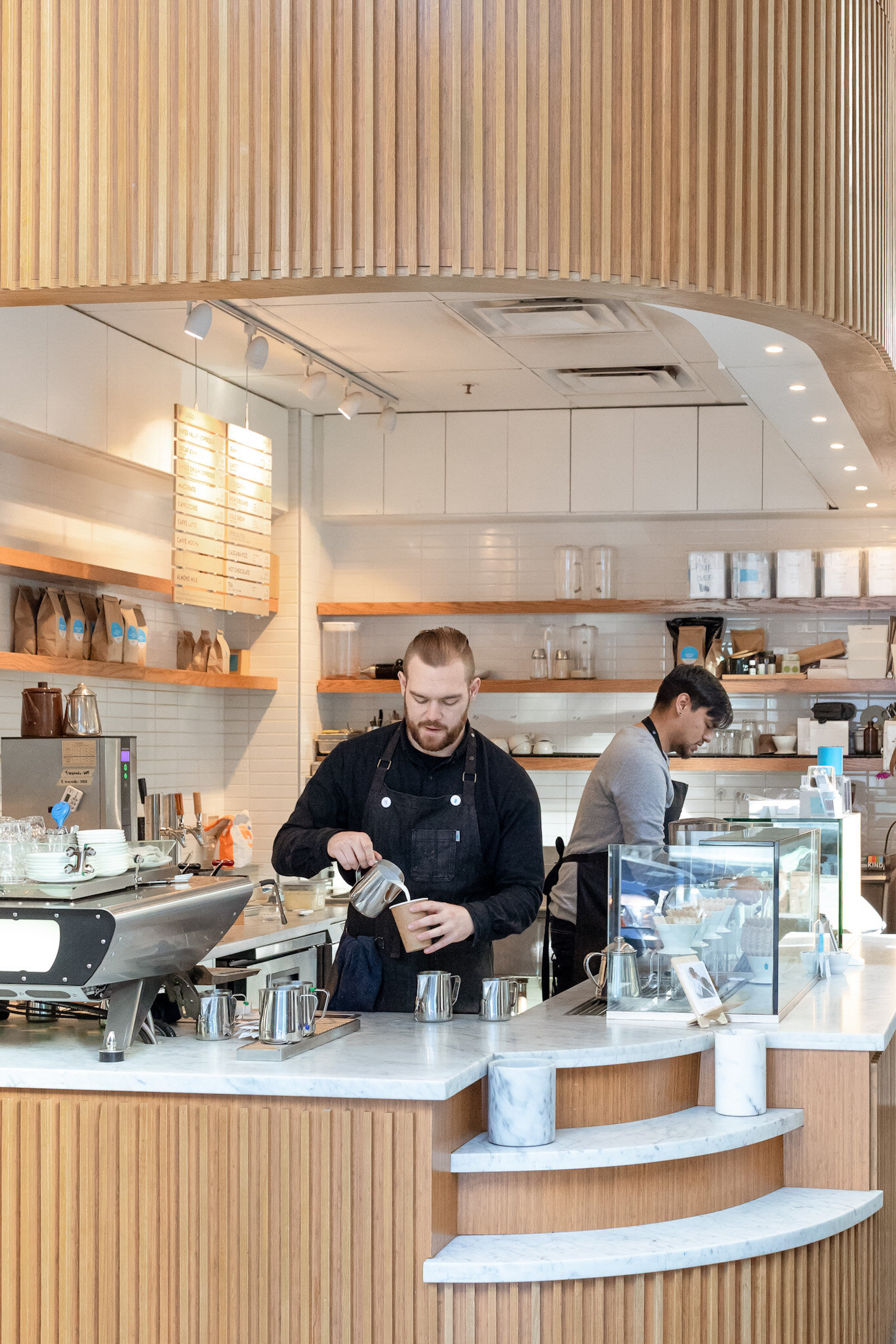
Our cafes are designed to draw focus on what matters: good coffee, daydreams, conversation, and the coffee professionals that make it all possible. In service of that aim, we keep the colors in our cafes elemental, focusing on just three: Blue Bottle Blue, Fog Grey, and blond wood.
On Blue
The blue of our logo is often the only pop of color in our cafes. Like Fog Grey, Blue Bottle Blue reflects our natural environment in the San Francisco Bay Area, where we’re surrounded by water. It reminds us of the cerulean sky after a rain, or the moment when the fog parts and the sunlight flows in. In addition to our cafes, you’ll also find it on our Hario cold brew bottle and our MiiR travel mug.
On Grey
In the Bay Area, thick layers of swirling fog can descend for days at a time. Its greyness can feel omnipresent and even melancholy—but can also inspire some of our best thinking, especially over a cup of good coffee. To capture its quiet beauty, we devised Fog Grey to match the color of a cloud-dense San Francisco sky. It’s warmer in tone than many greys, which gives it a welcoming rather than chilly vibe. In our cafes, you’ll see this color in many textures, whether polished concrete, marble, or painted shelving. You’ll also find it on our custom kettle by Fellow and ceramics by Hasami.
At our cafes in Japan, we use a different shade of grey inspired by our first cafe in Tokyo, which was housed in a former warehouse building in the Kiyosumi neighborhood. We painted the soaring facade in a pale grey that we loved so much, our designers now use it throughout our cafes in Asia. To celebrate the fifth anniversary of opening in Japan, we produced a limited edition collection of ceramics glazed in what we now call Kiyosumi grey.
On Blond Wood
Unless we’re designing a cafe to mimic the style of a historic building, we tend to reach for blond woods for our furniture and many of our finishes—maple, linden, ash, alder. These woods’ lighter tones contrast beautifully with the color of coffee—especially our red-toned single origins. We add them to accent some of our merchandise too. For example, the handle for our Blue Bottle x Fellow Kettle is made from maple, which feels as great as it looks. We looked to ash wood to create coasters that double as lids in our Hasami coffee service collection, while we pair our glass Kinto mugs with bamboo saucers.